
Sacro
Project Focus:
Branding / UX/UI Design
Year:
2024
Location :
Bogotá DC
Sacro was born as an erotic boutique that reclaims the body, desire, and play as sacred territories. The challenge was to build a visual identity capable of articulating eroticism, spirituality, and digital culture—without relying on clichés or risking censorship in sensitive environments. From naming to art direction, the project proposes a provocative, ritualistic aesthetic that finds its symbolic language in glitch, neon, and the digital body.
%207_41_44%20p_%C2%A0m_.png)
%207_39_24%20p_%C2%A0m_.png)
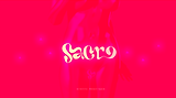
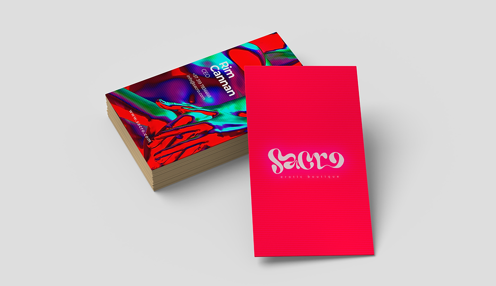
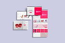
The logo was built from a custom typeface with dense, geometric forms and closed strokes that evoke ritual inscriptions or ceremonial tattoos. The slightly serpentine “S” and tight spacing give it a strong presence—like an invoking seal. The brand unfolds in a palette led by an electric neon red: vibrant and fluid, evoking heat, desire, energy, and transgression.
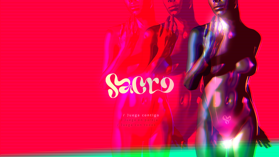
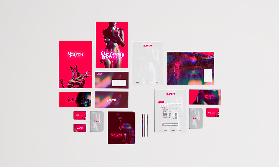
The entire visual universe—3D bodies, glitch effects, and the contrast between darkness and radiant light—articulates a visual sensuality that is sacred, digital, and radically contemporary. As a secondary symbol, a monogram derived from the custom typeface was developed into a stylized heart. This subtle icon appears throughout various brand materials, serving as an emotional and graphic emblem of the Sacro world.
%207_42_00%20p_%C2%A0m_.png)
%207_40_18%20p_%C2%A0m_.png)

In a context where erotic products are often censored on social media and digital platforms, Sacro’s art direction moves along the margins—creating visual tension without crossing into the explicit. The graphic system emphasizes the suggestive over the literal, the symbolic over the direct. This approach allows the brand to remain visible, provocative, and free from penalties—claiming a unique position within the digital ecosystem.
%207_41_22%20p_%C2%A0m_.png)
E-commerce UX/UI design
The Sacro website was conceived as an intimate digital experience, charged with intention. More than just a store, it functions as a sensory platform for desire—where every element, from the navigation structure to the visual composition, translates the brand’s symbolic, ritualistic, and provocative character.
The electric neon red functions as a vital accent—guiding attention and generating emotional tension without overwhelming the interface. The layout breathes: there is order, but also suggestion; clarity, but also mystery. This contrast builds a visual atmosphere that accompanies, seduces, and frames the act of purchasing as a ritual practice.

The site’s architecture is organized into four key categories—Play Yourself, Play in Couple, Play all, and BDSM—framing the shopping journey as an act of exploration rather than a purely transactional experience. The interface is designed to be clear, fluid, and tactile, with well-defined visual hierarchies and a minimalist approach that amplifies the emotional weight of the content. Unlike the brand’s social channels—where Sacro’s aesthetic must adapt to avoid censorship without losing its erotic essence—the website allows the brand universe to fully expand without restrictions, revealing the products in their full symbolic and visual power.

The website was developed on an advanced visual platform, optimized for mobile devices and designed to ensure aesthetic coherence, agile navigation, and autonomous content management. This positions Sacro as a disruptive brand within the independent erotic circuit. Its irreverent yet sensitive tone, cohesive aesthetics, and clear creative direction have established it as a reference point for new sensual proposals with a strong identity. The brand continues to expand its symbolic universe—from the intimate to the ritual.